Rebranding for Smiles
Year: 2019
Client: Smiles
We had a very creative task to come up with a re-brand for etisalat’s way of dealing with a reward app “smiles”
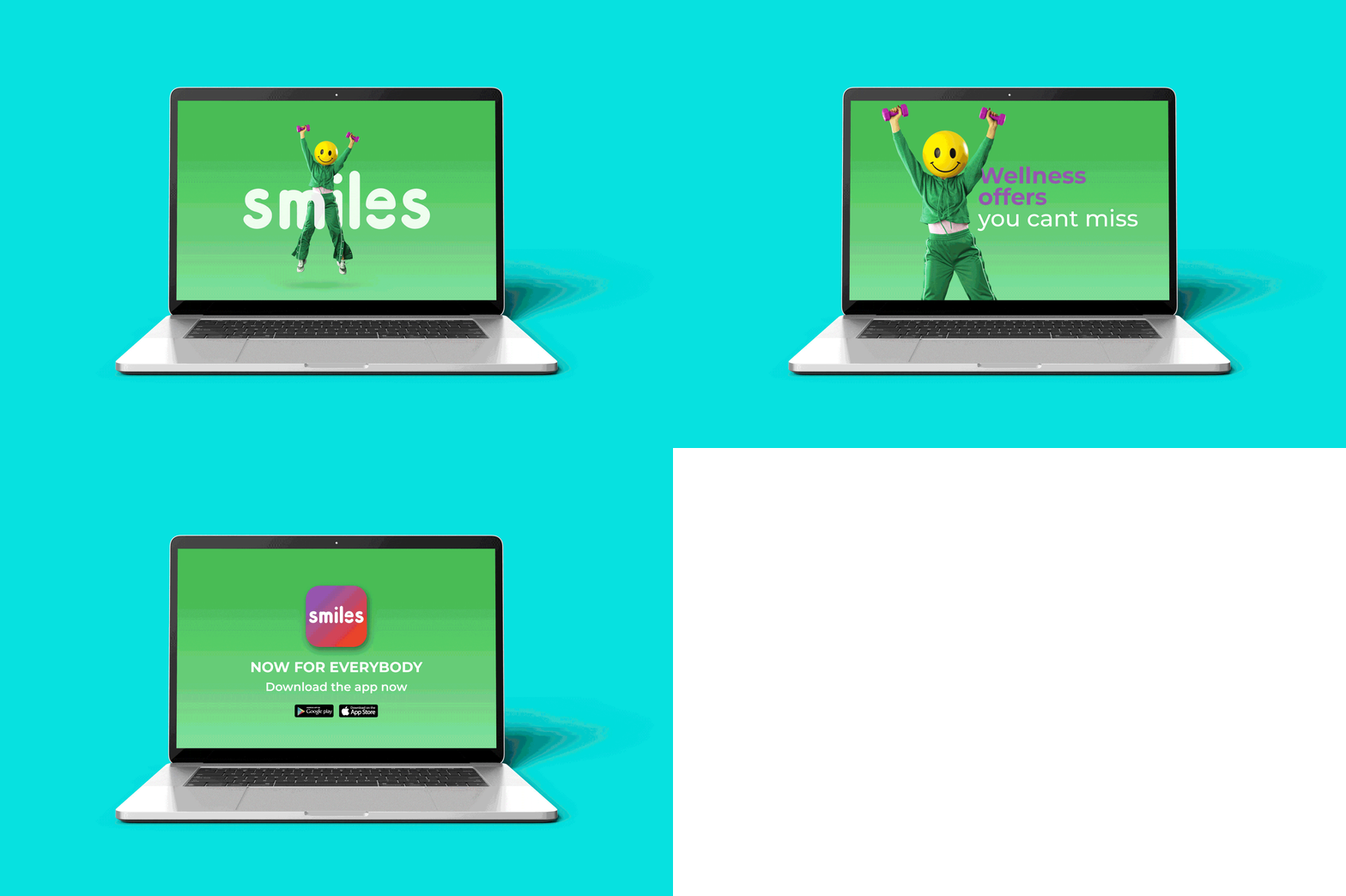
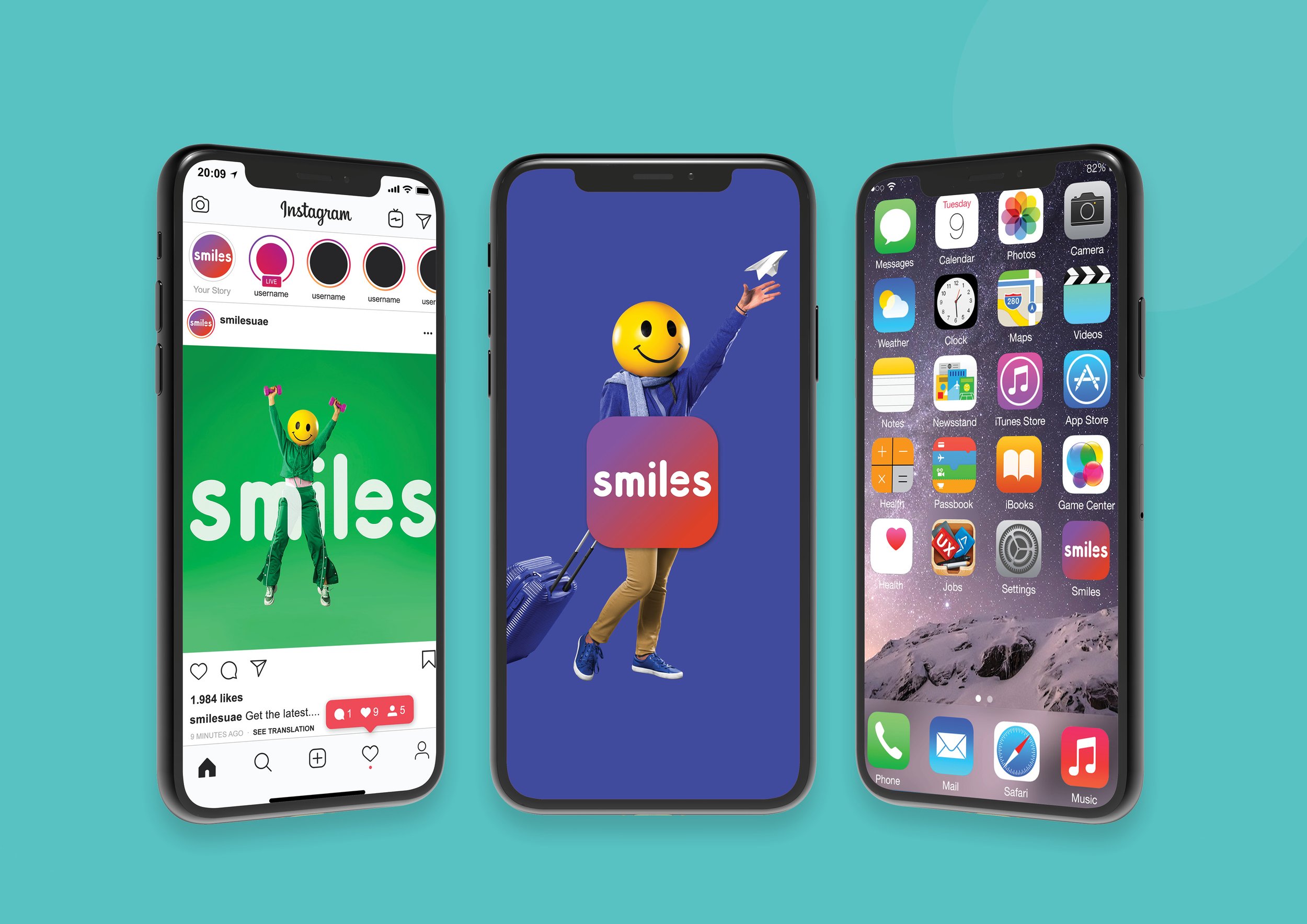
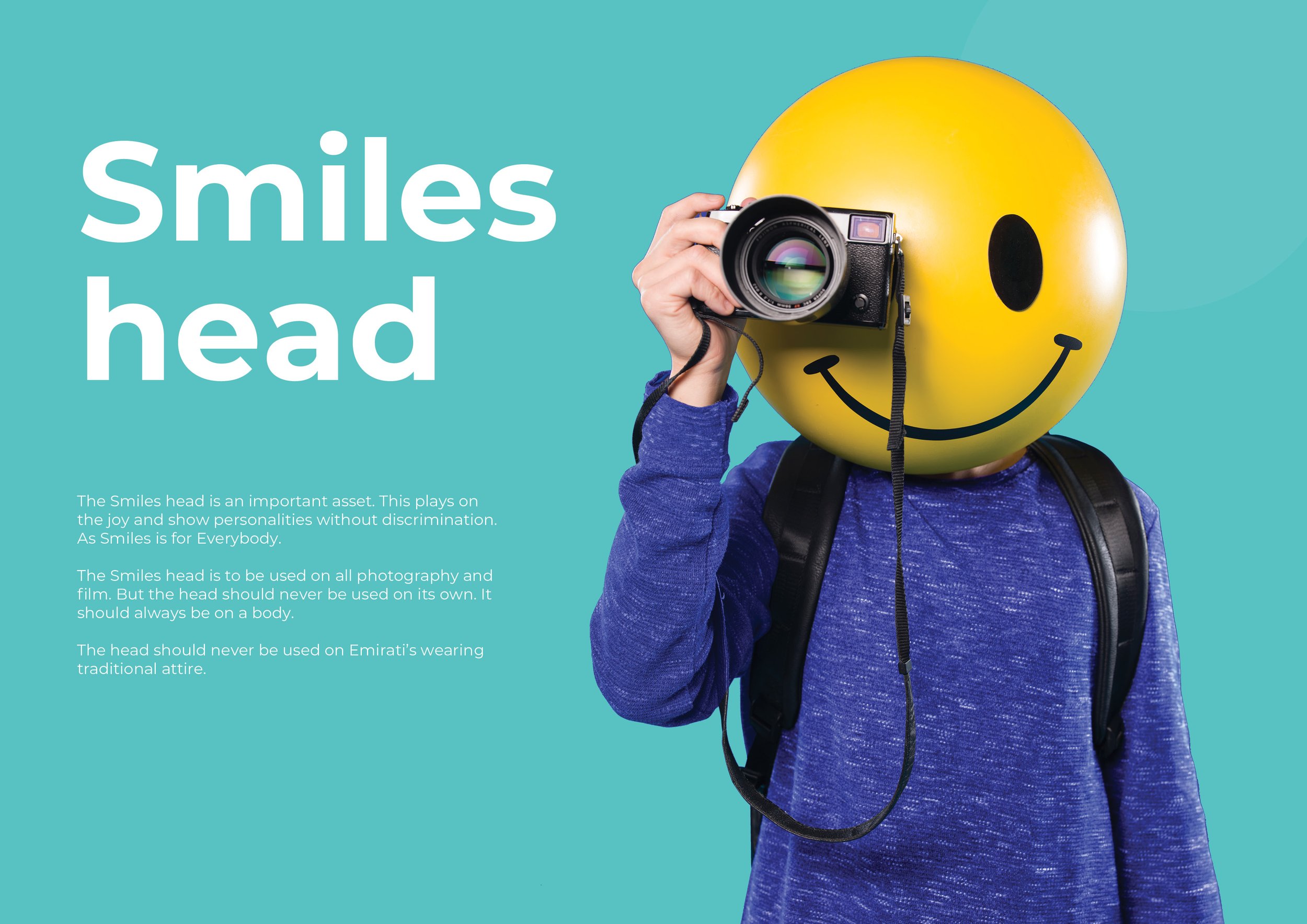
Smiles already had an old logo which needed to look more modern as moving forward with the brand we had to make it for everyone, so using fun inviting colors and bold/round typeface for the new logo we integrated it into the visuals using the smiles head brand mascot.

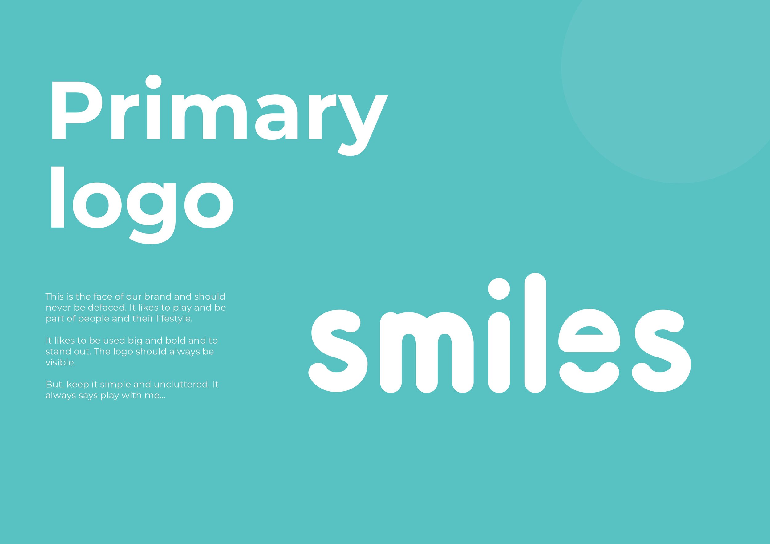
THE LOGO
The old logo was boxed in and used a very complex gradient, Using a bold typeface made it look more modern and having a rounder typeface with the smiles mascot head in the logo.



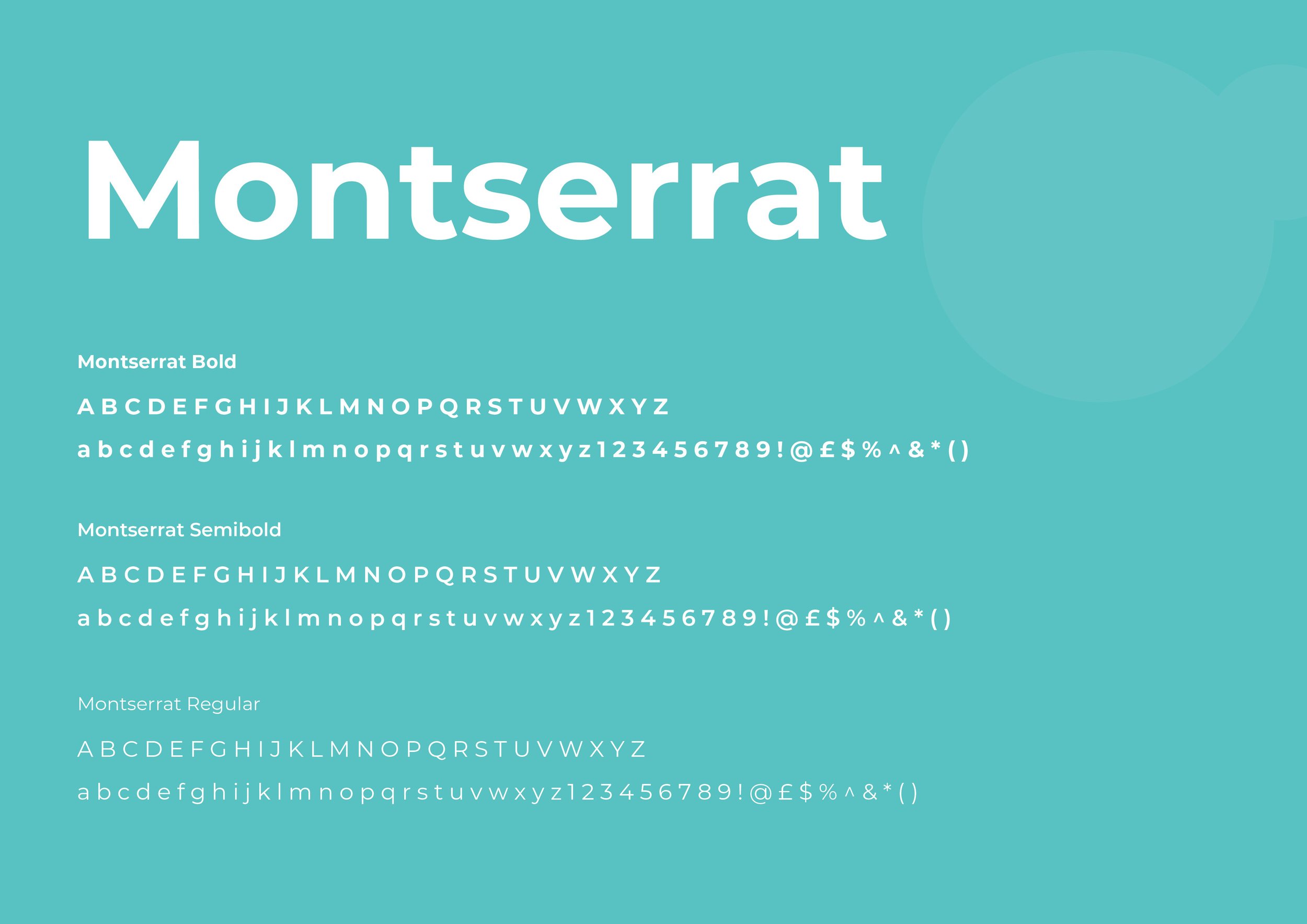
The Typography

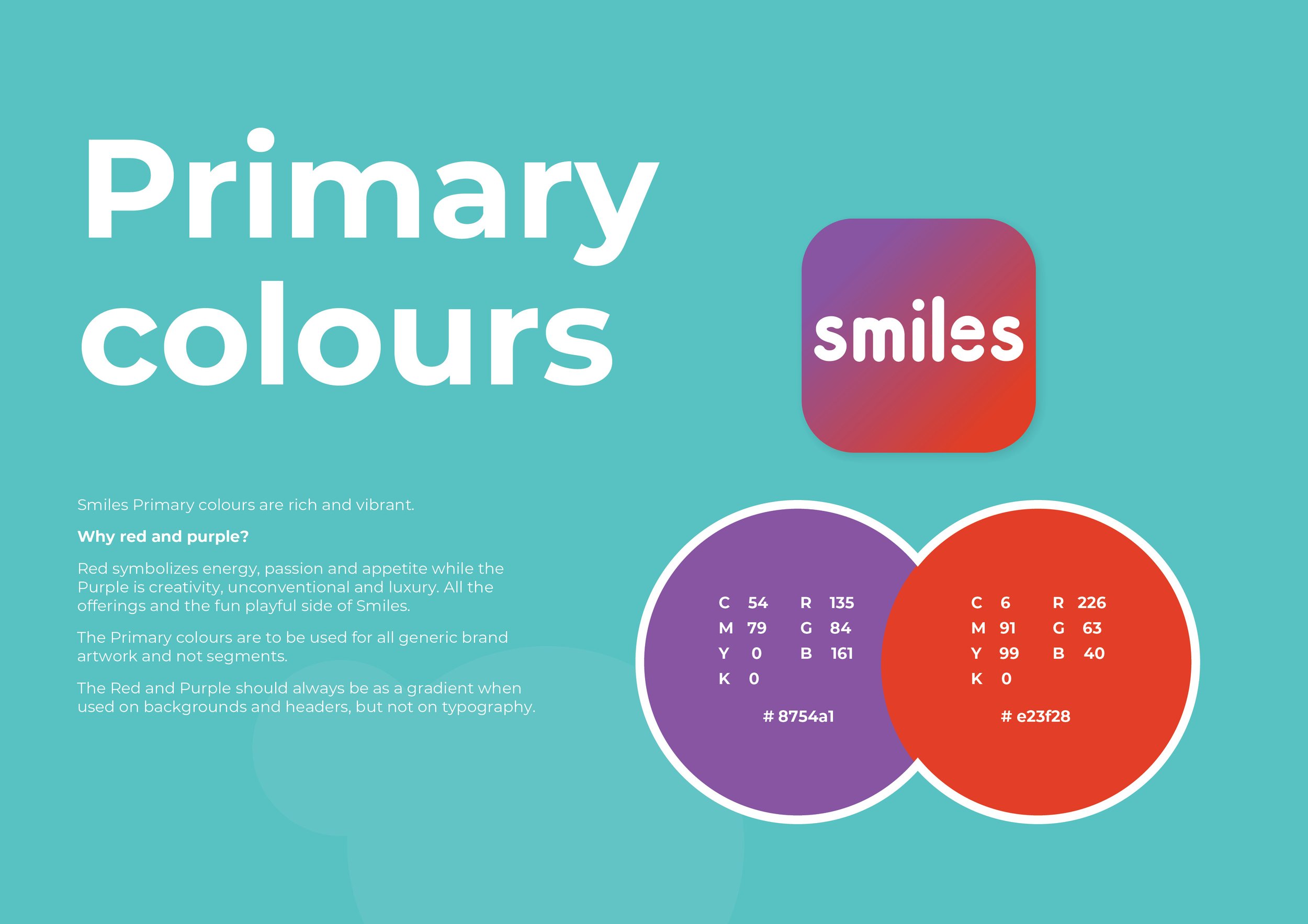
The colour palette
Colour for the brand was key, to create something that could stand out in the market while also having multiple colours for each segment.

The Designs
The smiles logo integrated into the designs and having dynamic movement with the photography helped bring all the elements of smiles together and showcasing what the brand is all about.
